Wed Oct 29 - Written by: Brendan McNulty
Week 44: Making newsletter merch with AI
Week 44: Making newsletter merch with AI
(from doom metal to Shrigley)
I wanted merch for this newsletter. Proper merch. The kind of thing I’d actually want to stick on my laptop or give to the three people who might care about 52 AI experiments.
My initial vision? A doom metal album cover aesthetic—heavy, ornate, with “52 AI Experiments” rendered in that illegible-but-awesome style you’d find on a metal album cover. I wanted a corrupted circuit board woven into the design, a nod to the AI theme without being obvious about it.
Then my wife suggested a different direction. And as per usual she was right.
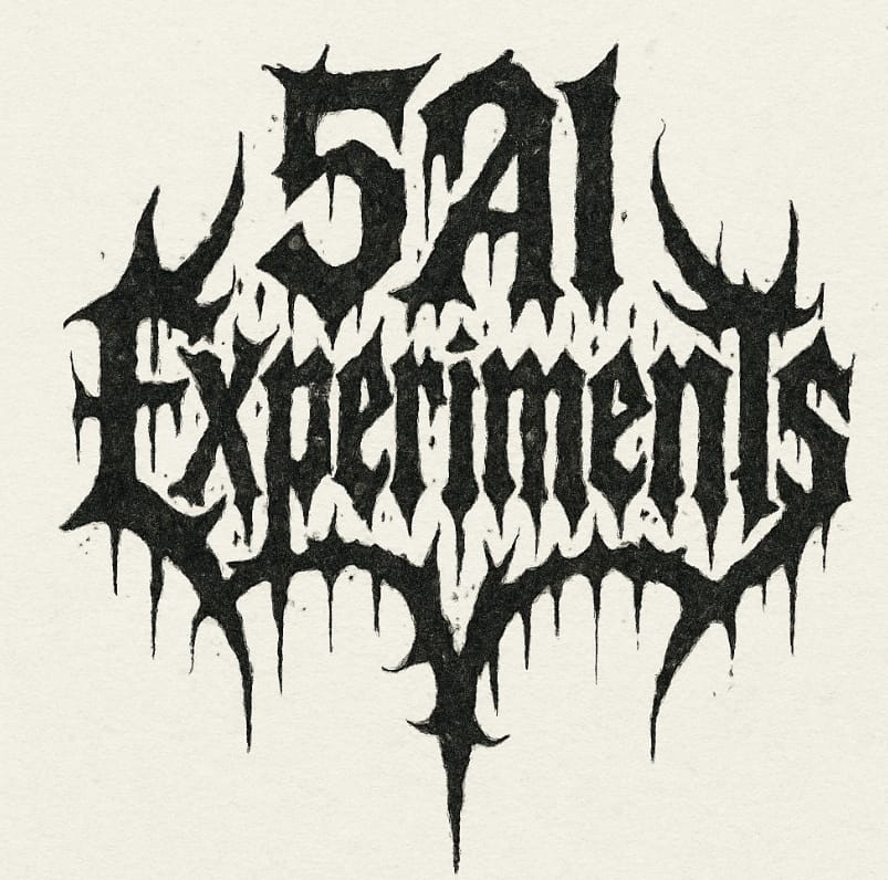
The Process
I started by trying to create a doom/black metal logo. I spent time calibrating the style—debating whether to go full doom (heavy, gritty, stark) or lean into black metal’s spikier aesthetic (as an aside I learned a lot about the different metal aesthetics through this process). I eventually settled on doom with stoner metal vibes.
The brief was clear:
- Text-only logo: “52 AI Experiments”
- Ornate but legible
- Hand-drawn ink aesthetic
- Compact enough for a sticker
- Black on white with that photocopied grain
Early attempts looked promising. Then I noticed a problem.
The “2” kept disappearing.
No matter how I phrased the prompt—“reads exactly: 52 AI Experiments,” enumerating every character, specifying “the numerals 52 form the top keystone”—the AI would either drop the “2” entirely or mutate it into something unrecognizable. Metal typography and AI do not play well together, especially with numerals.
I iterated. A lot. When I finally got a version where the “2” survived and the text was legible, it felt like a small victory against the machine.
That’s when my wife made her suggestion: why not try something in David Shrigley’s style instead?
I love Shrigley. His work has this deadpan, DIY, not-too-serious energy that perfectly captures what this project is actually about. It’s punk ethos over metal posturing—rough edges, intentional imperfection, and jokes that land because they’re drawn badly.
I asked the AI to define Shrigley’s style. It nailed it: naive line drawings, thick uneven strokes, handwritten all-caps text, compositions that feel like they were scribbled in a notebook during a boring meeting.
I briefed it with that aesthetic in mind—deadpan humor, thick lines, white backgrounds, minimal detail—and the results were great right out of the gate.
I created about 10 designs in one session. These three were the keepers:
- “I RAN 52 EXPERIMENTS. I LEARNED NOTHING. I FEEL GREAT.” – A beaker-headed scientist celebrating with arms raised, a tiny AI robot giving a thumbs up in the background.
- “THE PROMPT WAS FINE. I AM THE PROBLEM.” – A person having an existential crisis in front of their laptop, lightning bolts of frustration radiating from their head.
- “PROMPT / OUTPUT: I THINK IT BROKE.” – A browser window labeled “PROMPT” next to a blank-faced figure labeled “OUTPUT,” both looking equally confused.
The AI understood the assignment immediately. No iteration hell. No missing numerals. Just right (in a weird off way).
Once I had the designs, I needed to get them printed. I used ChatGPT’s built-in agent and asked it to find cheap sticker printing in Cape Town.
The agent came back with solid options pretty quickly. It wasn’t perfect—it didn’t automatically surface my previous printer—but it saved me from half an hour of Googling and comparing specs. Low friction, decent results, and cheaper than my usual printer option.
The whole research process took maybe 10 minutes instead of the usual rabbit hole.
The Outcome
I’ve got three Shrigley-style sticker designs that feel true to the project’s DIY spirit (and one metal one because why not). They’re funny, self-aware, and intentionally rough around the edges. More importantly, they’re something I’d actually want to own.
The agent handled the printer research efficiently—not groundbreaking, but better than doing it manually.
Key Takeaway
AI makes design accessible to non-designers, but you have to pick your battles. Complex typography with numerals? Pain. Naive, illustrative styles? Surprisingly easy. And sometimes your spouse’s creative input is worth more than another 20 iterations with a stubborn AI.
Pro Tips
- Start with forgiving styles: Shrigley-esque naive art is way easier to prompt than intricate metal logos. Save yourself the frustration.
- Embrace the punk DIY ethos: If your design looks a bit rough or imperfect, that might be the point. Let it be messy (this also fits into my “done is better than perfect” ideology)
- Use agents for boring research tasks: Finding local services, comparing specs, or pulling together options—agents handle this stuff faster than you can.
Want to Try It Yourself?
- For illustration: ChatGPT/Sora can handle Shrigley-style designs with simple prompts (thick lines, deadpan humor, naive drawing style).
- For agent-based research: Use ChatGPT’s built-in agent or similar tools to offload tedious comparison tasks.
- For printing: Just ask an agent to find local options—saves time and decision fatigue.
And remember: it’s not about being metal. It’s about being punk. Do it yourself, make it weird, and don’t overthink it.